

Most photographers have experienced the frustration of capturing a great shot only to discover that it feels flat when viewed on a larger screen. The composition works, the lighting looks good, and the subject is exactly where it should be, yet the image lacks the impact you remember seeing through the viewfinder. In many cases, the missing ingredient isn’t the camera or the lens. It’s the color.
Color grading is one of the most effective ways to transform an ordinary photo into something memorable. It adds mood, enhances visual storytelling, and helps establish a recognizable style. While many photographers focus heavily on camera settings and gear upgrades, learning a few practical color grading tips can often make a bigger difference to the final image than buying new equipment.
Understand the Difference Between Color Correction and Color Grading
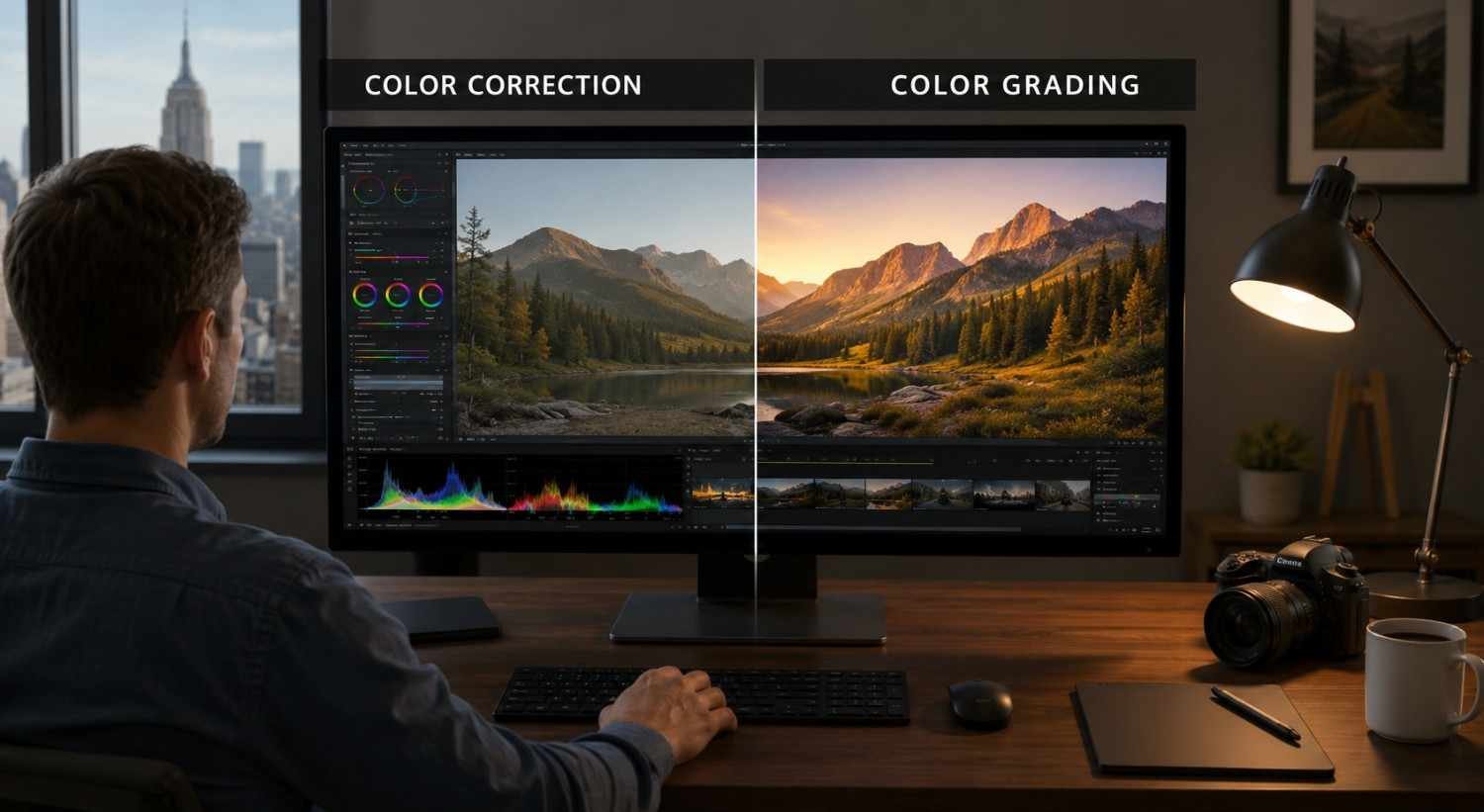
Before applying creative effects, it’s important to separate color correction from color grading.
Color correction focuses on technical accuracy. This stage involves fixing exposure issues, balancing highlights and shadows, correcting white balance, and ensuring colors appear natural. Think of it as preparing a clean foundation.
Color grading comes afterward. This is where you shape the mood and atmosphere of the image. Whether you’re aiming for a cinematic look, a warm editorial feel, or a moody landscape aesthetic, color grading allows you to create an emotional response from the viewer.
Many beginners skip straight to creative effects, but professional photo editing always starts with a technically balanced image.
Start With a Neutral Canvas
One of the most valuable color grading techniques is surprisingly simple: don’t start grading too early.
Begin by correcting exposure and checking that neither shadows nor highlights are clipping. Then adjust white balance to remove unwanted color casts. Even a slight temperature issue can affect every grading decision that follows.
Keeping your correction adjustments separate from your grading adjustments also makes future revisions easier. If you decide later that the image needs a different mood, you can change the grading without rebuilding the entire edit.
A clean starting point gives your creative choices much more control and consistency.
Use Color Harmony to Create a Better Mood
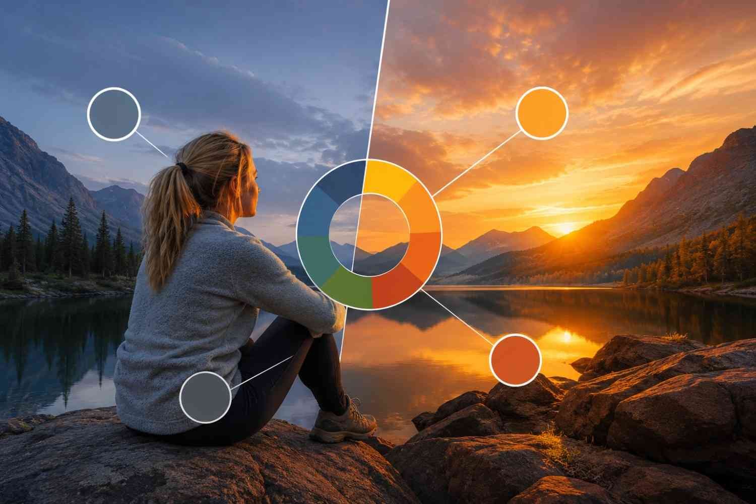
Color combinations have a direct influence on how viewers interpret an image. Understanding basic color harmony can instantly improve your color grading results.
One of the most popular approaches is the cinematic orange-and-teal combination. Warm orange tones in the highlights and midtones create a sense of energy, while cooler teal shadows add contrast and depth. This balance helps subjects stand out without making the image feel unnatural.
Nature photography often benefits from earthy combinations such as muted greens paired with reddish-brown tones. These colors feel organic and help create a richer atmosphere.
For softer images, try using analogous colors. Shades that sit next to each other on the color wheel—such as yellow, orange, and gold—create smooth transitions and a cohesive visual flow that works especially well in sunrise and sunset photography.
The goal isn’t dramatic color shifts. It’s creating harmony that supports the story your image is trying to tell.
Follow the 60-30-10 Color Rule
Many photos feel visually chaotic because too many colors compete for attention.
A useful principle borrowed from design is the 60-30-10 rule.
- 60% of the image should contain a dominant color.
- 30% should feature a secondary color that adds contrast.
- 10% should consist of an accent color that draws attention.
This simple framework helps organize your color palette and creates stronger visual hierarchy.
For example, a portrait may feature neutral environmental tones as the dominant color, complementary clothing colors as the secondary element, and a small vibrant accessory as the accent. The result feels intentional rather than overwhelming.
Improve Contrast Before Increasing Saturation

When a photo looks dull, many photographers immediately increase saturation. Unfortunately, this often leads to unrealistic colors and an overprocessed appearance.
A better approach is to improve tonal contrast first.
Adjust highlights, shadows, whites, and blacks to create depth throughout the image. Strong tonal separation naturally makes colors appear richer and more vibrant, even without significant saturation changes.
This method also preserves realistic skin tones and prevents the artificial look that often appears when colors become overly intense.
In many cases, proper contrast control delivers more visual impact than aggressive color adjustments.
Use Vibrance More Often Than Saturation
If your editing software includes both vibrance and saturation controls, prioritize vibrance whenever possible.
Saturation increases the intensity of all colors equally. This can quickly push skin tones, foliage, and bright objects beyond natural limits.
Vibrance works more selectively. It boosts muted colors while protecting already saturated areas, resulting in a more balanced and professional appearance.
This makes vibrance especially useful for portrait photography, travel photography, and lifestyle content where maintaining realistic color is important.
Small vibrance adjustments often create cleaner results than large saturation boosts.
Fine-Tune Individual Colors for a Professional Look
Global adjustments can only take an image so far. The most refined color grading often happens when you start working with individual color channels.
Greens are a common problem area. Grass and foliage can easily become oversaturated and appear fluorescent. Shifting greens slightly toward yellow or reducing their saturation often creates a more natural appearance.
Yellows can benefit from a subtle shift toward orange, helping create the warm editorial style commonly seen in commercial photography and magazine imagery.
Blues are another color worth monitoring. Slightly reducing blue saturation in urban scenes can create a cleaner and more sophisticated palette while helping important subjects stand out.
These adjustments may seem minor, but they often produce the biggest improvements.
Build a Consistent Editing Workflow
Consistency is one of the biggest differences between casual editing and professional post-processing.
Having a repeatable workflow helps you create a recognizable visual style while reducing editing time. This becomes especially valuable when managing large photo collections or maintaining a stock photography workflow across hundreds of images.
A practical workflow often follows this sequence:
- Correct exposure and white balance.
- Adjust tonal contrast.
- Establish the overall color palette.
- Refine individual color channels.
- Reduce distractions and noise.
- Review multiple images together for consistency.
Following the same process repeatedly makes it easier to achieve predictable results and maintain quality across your entire portfolio.
FAQs: Simple Color Grading Tips That Instantly Improve Your Photos
1. What is the main purpose of color grading?
Color grading enhances mood, atmosphere, and visual storytelling. It helps photographers create a specific emotional response while developing a unique editing style.
2. Is color grading only for professional photographers?
No. Beginners can benefit from color grading just as much as professionals. Learning a few basic techniques can significantly improve image quality and consistency.
3. Should I color grade JPEG or RAW files?
RAW files provide more editing flexibility because they retain significantly more image data. This makes color grading adjustments smoother and more accurate.
4. How can I avoid over-editing my photos?
Take breaks during editing, compare your image with the original version, and focus on subtle adjustments. If the editing becomes the first thing viewers notice, you’ve probably gone too far.
Why Great Color Grading Feels Effortless
The best color grading rarely announces itself. Instead, it quietly supports the composition, strengthens the lighting, and reinforces the story already present in the image. Viewers may not consciously recognize the adjustments, but they’ll notice how the photo makes them feel. That’s why experienced photographers often spend more time refining subtle details than applying dramatic effects.
A strong edit doesn’t need extreme colors to stand out. It simply needs colors that work together, guide attention, and help the image communicate exactly what you intended.


