

A hero image can become the largest visual element on a webpage—and one of its biggest performance liabilities. HTTP Archive found that images were the Largest Contentful Paint element on roughly 73% of mobile pages and 83% of desktop pages in its 2024 performance analysis.
That makes hero image design best practices about much more than choosing an attractive photograph. The opening section has to communicate the offer, preserve readable text, survive unpredictable mobile cropping, load quickly, support accessibility, and direct attention toward the action you want visitors to take. Done well, the image becomes part of the interface rather than decoration competing with it.
A Hero Image Has One Job: Support the Message
The strongest hero sections answer a visitor’s first questions almost immediately: What is this? Is it relevant to me? What should I do next? The image should help answer those questions rather than create another puzzle.
Harvard’s Digital Accessibility Services advises using images and media purposefully because visually arresting elements can distract from a page’s purpose when they do not reinforce its content.
That principle translates directly into commercial design. A software company might show its actual dashboard. A furniture retailer could feature the product inside a believable home. A creative agency may use commissioned artwork that communicates its personality. A generic office stock photo rarely explains anything.
Before approving a hero image, ask a simple question: If I removed this visual, would visitors understand the offer differently? If the answer is no, consider replacing it with something more relevant—or removing it altogether.
Design for Cropping Before Designing for Beauty
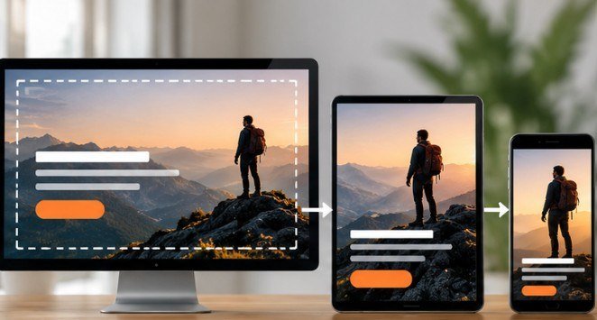
Hero photography is unusually difficult because the same image may appear on a wide desktop monitor, a laptop, a tablet, and a narrow phone.
The National Science Foundation recommends a wide format for hero components, with 1920 × 1080 pixels as its preferred full-size 16:9 option. More importantly, NSF warns that responsive hero images can crop substantially as screen dimensions change. That means your composition needs a “safe zone.”
Keep the Critical Subject Away From Fragile Edges
Place the subject where moderate cropping will not destroy the meaning. Faces, products, hands, logos, and other essential elements should not sit against the extreme left or right edge.
Then identify where the headline will appear.
If your text occupies the left half, choose or crop an image with quieter negative space there and place the strongest visual interest farther right. This creates hierarchy without relying on heavy effects.
For mobile layouts, consider an alternate portrait crop rather than shrinking the desktop image until the subject becomes insignificant.
The best test is brutally simple: preview the hero at several widths and deliberately crop 20–30% from different edges. If the message collapses, the original composition is too fragile.
Protect the Headline From the Photograph
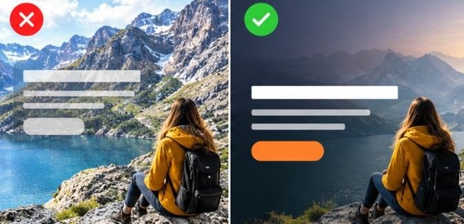
Beautiful photography can still produce terrible typography.
Detailed foliage, patterned clothing, bright windows, textured walls, or high-contrast backgrounds can make overlay copy difficult to read. The University of Washington notes that inadequate contrast creates problems not only for people with low vision but also for users viewing screens under difficult conditions such as bright light.
Use quieter image areas for copy wherever possible. If that is not enough, add a controlled gradient, darkened region, light wash, or solid text container behind the headline. The objective is not to make the image dramatic; it is to create dependable separation between foreground content and background imagery.
Your CTA should receive similar treatment. A beautiful transparent button that disappears into the photograph is not an effective conversion element.
Keep Important Words Out of the Image File
Embedding headlines, promotional copy, prices, or button labels into JPEGs may make design mockups easier, but it creates problems later.
W3C recommends using real text rather than images of text wherever possible because actual text can be resized, restyled, translated, and adapted more effectively.
The NSF similarly advises against text inside hero images because responsive cropping can obscure it and create accessibility issues.
Build the photograph and interface separately:
Image → visual atmosphere
HTML text → headline and supporting message
CSS → positioning and styling
Button → interactive CTA
That structure gives developers far more freedom to adapt the experience across breakpoints.
If you’re developing supporting visuals elsewhere on the page, these infographic design tips for content marketers can help maintain the same clarity and information hierarchy.
Performance Is Part of Hero Image Design
A visually perfect hero that arrives late is not perfect.
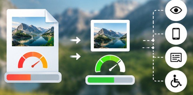
HTTP Archive reported that images accounted for the LCP element on 68% of mobile pages in its broader 2024 media analysis. It also found that modern formats such as WebP and AVIF can reduce image size through more efficient compression.
So hero image design best practices should include an asset-production workflow, not merely composition rules.
Export the image close to its actual display requirements rather than uploading a huge camera original. Generate responsive variants so phones are not forced to download desktop-sized assets. Compare WebP and AVIF against optimized JPEG output and choose the smallest version that preserves acceptable visual quality.
Avoid automatically lazy-loading the primary above-the-fold hero image when it is expected to become the LCP element. The browser needs to discover and request critical visual content promptly.
Performance testing should happen on a throttled mobile connection, not only on the designer’s office Wi-Fi.
Accessibility Should Survive the Finished Design
Accessibility decisions depend partly on what role the hero plays. If it is purely decorative and the adjacent heading communicates everything necessary, it may need an empty alternative text value so assistive technology can ignore it. W3C distinguishes decorative images from informative images and recommends meaningful text alternatives when imagery communicates useful information.
Section508.gov makes the same practical point: alternative text should communicate the meaning or function of relevant imagery rather than unnecessarily describing every visible detail.
Ask: Does understanding this picture change someone’s understanding of the page? If yes, provide meaningful alt text. If no, treat it as decorative according to the implementation method being used.
Use Motion Only When It Earns Its Bandwidth
Video heroes can demonstrate products beautifully. They can also make a homepage slower, louder, and harder to concentrate on. Keep background clips short, compressed, muted, and visually restrained. Never make essential information dependent on watching the video.
Most importantly, give users control over persistent motion. W3C accessibility guidance emphasizes providing ways to pause or stop animations because movement can distract users and make content harder to consume.
Motion should reveal something a still image cannot. If a static photograph communicates the same idea, it is often the smarter choice.
The 60-Second Hero Image Test
Before publishing, run through six questions:
- Can someone identify the page’s purpose within five seconds?
- Does the visual reinforce the headline instead of merely filling space?
- Is the subject still meaningful when viewed on a narrow phone?
- Can every headline and CTA be read against every part of the background?
- Is important copy rendered as real webpage text rather than baked into the image?
- Does the compressed hero load quickly on a simulated mobile connection?
Then temporarily hide the image.
If the page becomes easier to understand without it, redesign the hero. The visual should strengthen hierarchy rather than compensate for weak messaging.
For brands building visual systems beyond the homepage, exploring visual content ideas for social media marketing and learning how to create shareable visual content can help extend the same principles across channels.
Frequently Asked Questions
1. What is the best size for a website hero image?
There is no universal size, but 1920 × 1080 pixels is a practical high-resolution 16:9 starting point. Responsive variants and mobile-specific crops are more important than relying on one fixed dimension.
2. Should hero images contain text?
Generally, no. Keep headlines and CTAs as live HTML text so they remain readable, accessible, responsive, searchable, and easier to update.
3. Is WebP or AVIF better for hero images?
Both can provide excellent compression. Test actual exported files because image complexity and browser requirements affect results. Choose the smallest format that maintains acceptable quality.
4. Do all hero images need alt text?
No. Informative images need meaningful alternatives, while purely decorative imagery can usually use empty alt text so screen readers skip it.
Final Takeaway
The best hero section is not necessarily the one with the most spectacular photograph. It is the one where the photograph, headline, CTA, accessibility choices, responsive behavior, and loading strategy feel like a single system.
The opening image may occupy more screen space than anything else, but it should never demand more attention than the message itself. Apply hero image design best practices by testing the visual under cropping, slow connections, small screens, and real reading conditions—not just inside a perfect desktop mockup. If the offer stays obvious under all four, the image is doing its job.